Getting started
My first post here is a collection of old BI projects. I wavered on whether or not to post these since they’re no longer representative of my current work, but in the end I felt like it could be useful for early career analysts to see how another data professional has developed over the years. In that spirit, I’ll critique each of these projects with an eye to what I would do differently if I were starting the project again from scratch.
Constructive Feedback to Me
Obligatory COVID Tracking Dashboard
First up is a COVID tracking dashboard made when COVID infections in the United States were still in the range of a few hundred cases.

This was one of my first projects in Power BI, and it actually turned out much better than I originally thought it might. Time, the trajectory of caseloads, and some Power BI Service updates have not been kind to it, however, and there are several things I’d do differently if I were to start again including:
- Not trying to fit everything onto one page. Clearly, this has resulted in a crowded and visually overloaded dashboard with visualizations and data points nearly on top of one another. A simple way to nearly double the real estate here would be to use a toggle to switch between cases and deaths KPIs
- Use more appropriate font sizes. Yeesh – enough said!
- For the maps, use conditional formatting rules that weather the increase in cases much more flexibly. In order to make them look most appealing at the time, I used hard-coded values to determine the shading of the filled maps. Definitely not ideal.
- Include far more context for key metrics. For example, since we’re looking at national values, it could be really useful to compare how the U.S. is doing relative to other nations.
There are several things that I like and appreciate about this original project, however, and I don’t want to spend the whole post being hard on my former self. Despite not using a moving window, I really like that I implemented a rolling average while retaining the actual daily values in the bottom-most charts. I haven’t posted the .pbix, but looking at it I also can appreciate that I took care to have a nicely documented process with consistent naming for measures and the like. Finally, I’m glad that I used color sparingly and consistently and took care with the more hidden bits like tooltips.
COVID Journal Publications Dashboard
More Power BI and more COVID in this dashboard that allows the user to explore journal articles published on COVID research. This project was slapped together quickly in response to needing more Power BI content for a job application. I was already familiar with Dimensions data, and so I decided use the open COVID dataset to pull together an overview by topic area.

This dashboard ended up having a much cleaner layout, but there are a couple of critical flaws. One is that I didn’t take the time to clean up the features around the edges, things like tooltips and non-human-friendly variable names come through in various places.
The second and more critical issue here is that, while I had the general idea in mind for a user to explore COVID research papers by Dimensions topic areas, the dashboard doesn’t have a clear purpose. This is something that I’ll come back to shortly in my Looker Studio report below, and it’s so important that I want to restate it again:
For a dashboarding project to be successful, you must be able to clearly articulate the purspose and audience.
I have seen an untold number of dashboards that were essentially built because, “Well, we have this cool data, so let’s make a dashboard out of it!” Even if you can make something pretty, clean, and logically consistent, the impact of any data tool can only be multiplied by having a clearly stated purpose and audience. The reason for this is that having a clear goal forces the developer to choose features that increase the usability for some use cases and users while simultaneously decreasing it for others. These tradeoffs are key to having a purpose-built tool, and without them you typically end up with an overly generic product that doesn’t succeed at doing much of anything specific for anyone.
This is exactly what happened in the case of this publications dashboard. It lacked focus, purpose, and a clear audience, and so its features ended up being generic and not particularly useful.
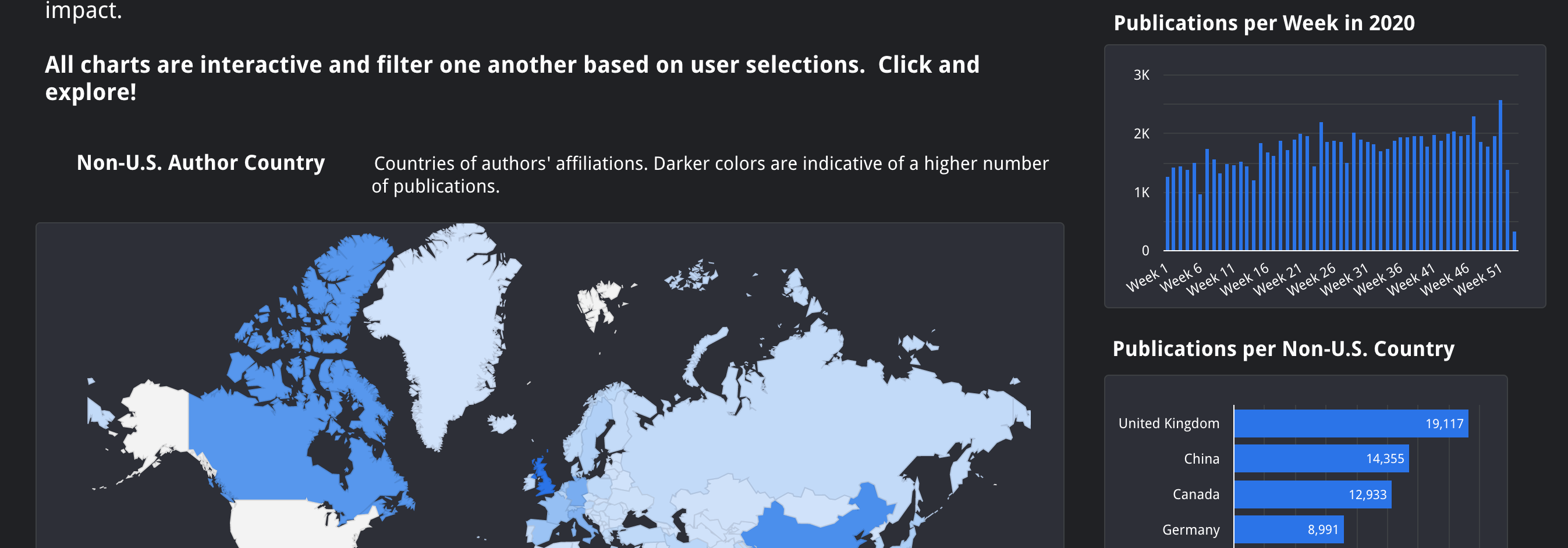
COVID International Collaborations Dashboard
The last of my three COVID projects is a Google Data Studio (now Looker Studio) report that provides a good counter-example to the relatively purposeless dashboard above. It even uses the same dataset. Even though this was a generic personal project, I came up with a very specific, theoretical use case that clarified the purpose and audience of the dashboard, giving it a much clearer focus. I even wrote it at the top of the dashboard.

The resulting work product is much more in scrolling report form with the intent being that the relatively novice user might need to dig into the details of individual publications after cross-filtering with the charts above. The final report still has the same cleanliness and general styling as the generic pubs dashboard above, but the the tradeoffs I made to enable this use case make it much more specific and, I would argue, much more useful.
Here my only major critiques are around not taking additional care with data quality. For instance, there are multiple records for the same author at different institutions, and it would have been more effective to try to match at least some of the more prolific authors across their affiliations. At the end of the day, however, I’m pretty pleased with how this turned out.
Summing up
My best advice after reviewing these projects comes down to this:
Make the audience and purpose of your work product explicitly clear. Write it down. If there are too many audiences to satisfy, either clarify the audience and use case or break up the report into multiple versions with different users in mind for each version.